Design
Our newspaper is fully digital, which means that we don’t have people working on the layout of a monthly issue like other schools do. At the end of the year, we create a print edition which is a collection of the best articles published throughout that school year. However, only the Editor-in-Chief or Executive Editor are in charge of designing it and that normally happens during the month of May.
We are still encouraged to create our own graphics if it’s necessary for our articles. Here are some I’ve made for myself and for other members on the staff.
Graphics
I’ll be honest, I have a love-hate relationship with making graphics. But ever since the pandemic happened, I began experimenting with them instead of relying on AP images for my articles. I am not the best at creating graphics, but I’m proud of how far I’ve come. Below are some examples of what I’ve made.

New banner
Our site needed a makeover.
We started out by redesigning our banner. We wanted to keep it minimal, similar to The Washington Post or The New York Times. My advisor wanted to include our slogan and our location, so I made sure to add that as well.
For more details on our site makeover, head over to web.
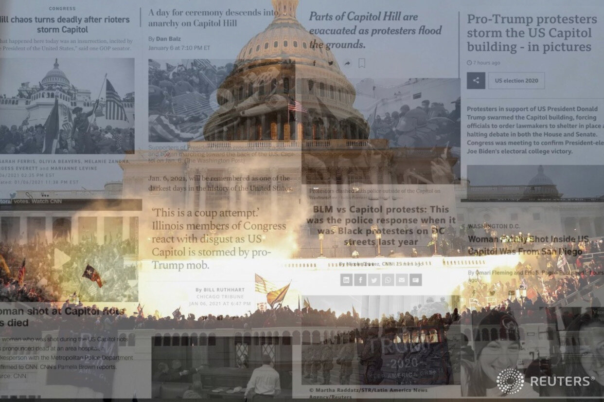
Battle at the hill: rioters storm the nation’s capital
Published: January 7, 2021, The Knight Crier
About: When I was thinking about what graphic I wanted to make for this article, the first two things that came into my mind were the headlines about the incident and the photo of the rioters storming Capitol Hill. I decided to combine the two ideas. The image of the Capitol was such a powerful photo and photoshopping that with the headlines portrays how disastrous the entire day was. There were so many different stories coming out that represented multiple perspectives and I wanted the image to fully capture the eventfulness of that day.
Read the article here.

OPINION: One Step Forward is Another Two Steps Backward
Published: October 28, 2020, The Knight Crier
About: A staff member reached out and said she didn’t have ideas for a graphic. After reading the article, I immediately had a vision of a minimal graphic. I made the background image black and white so that the photo of Amy Coney Barret stood out. The end result was minimal, yet sophisticated and it came out exactly how I wanted it to look.
Read the article here.

Cast your votes in NPHS’s upcoming mock election
Published: October 28, 2020, The Knight Crier
About: As I was writing this article advertising our high school’s mock election, I knew I wanted my graphic to feature the candidates. I spent hours upon hours cropping each photo and assembling them to my liking. At first, they had colors, but I felt like the colors made them clash, so I added a black an white filter, which helped hide the fact that they were all different qualities and were taken in different angles and lighting. I added both red and blue for some sort of pop of color. After a few tears and many groans in frustration, I came up with this. I was very proud of how it turned out then and I’m still proud of it now.
Read the article here.

Local Elections not to be overshadowed in 2020
Published: October 19, 2020, The Knight Crier
About: I was preparing to upload a side by side article written by a staff writer who interviewed the candidates running for the PA House of Representatives for District 151. We use the platform SNO for our website and when you post a side by side, even if you have pictures for the separate articles, if you don’t have a featured image for the general article as a whole, it only shows the headline on the site. I quickly created a graphic that showed the professional photos taken of the candidates but also made the layout clean and bright.
Read the article here.

North Penn’s Tik Tok Hall of Fame
Published: March 4, 2020, The Knight Crier
About: It was 11 PM and I got a text.
“Hey, I just shared my article with you, but I don’t have a graphic.”
“Hold on. I have an idea.”
I instantly got to work and came up with this. I made the background have a faded filter to make the words stand out. I wanted to show the Tik Tokers in some way, so I used screenshots to create a background. As for the words, I added the colors of the Tik Tok logo on the words “Hall of Fame” to make it cohesive. It was simple editing, but it served its purpose.
Read the article here.